
The Beauty of Symmetry
Or is it? My preference for balanced design and some remarkable exceptions.
19 August 2023 at 20:12 CEST
No Comments
Usually I appreciate symmetrical watch dials. The balance, the cleanliness and the equally distributed elements on the dials are more appealing to my eyes. A classical example of an unbalanced dial is a watch with the date complication at 3 o’clock. I guess it’s my watchmaking pet peeve. I belong to the category of watch enthusiasts that definitely prefer the date at 6 or, in case, at 4:30. Sometimes the absence of the date is even a better solution.
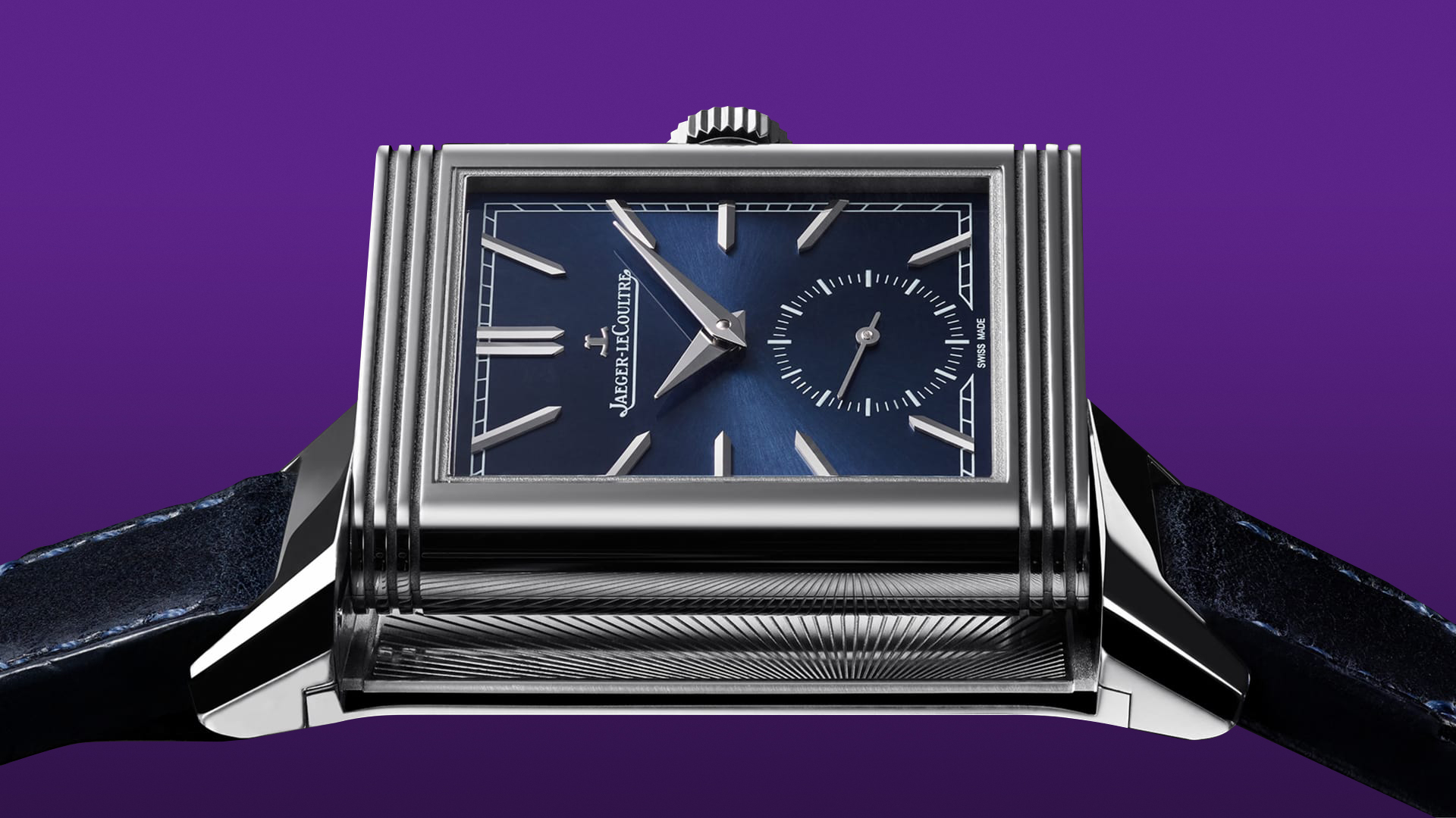
The clean symmetry of the Jaeger‑LeCoultre Reverso Tribute Monoface Small Seconds – Ref. Q397848J. Source: Jaeger‑LeCoultre.
Some designs carrying the date at 3 o’clock are worse, others are more acceptable because the final result seems to me more polished and well thought. Still, if the same watch reference would be available in both variants, I’d easily discard the model with the date at 3 and turn to the model with the alternative date position.
To me, quite a lot of watches are “ruined” simply because the date is misplaced. They carry often an otherwise attractive design: that small detail, though, is a sour note my mind can’t ignore.
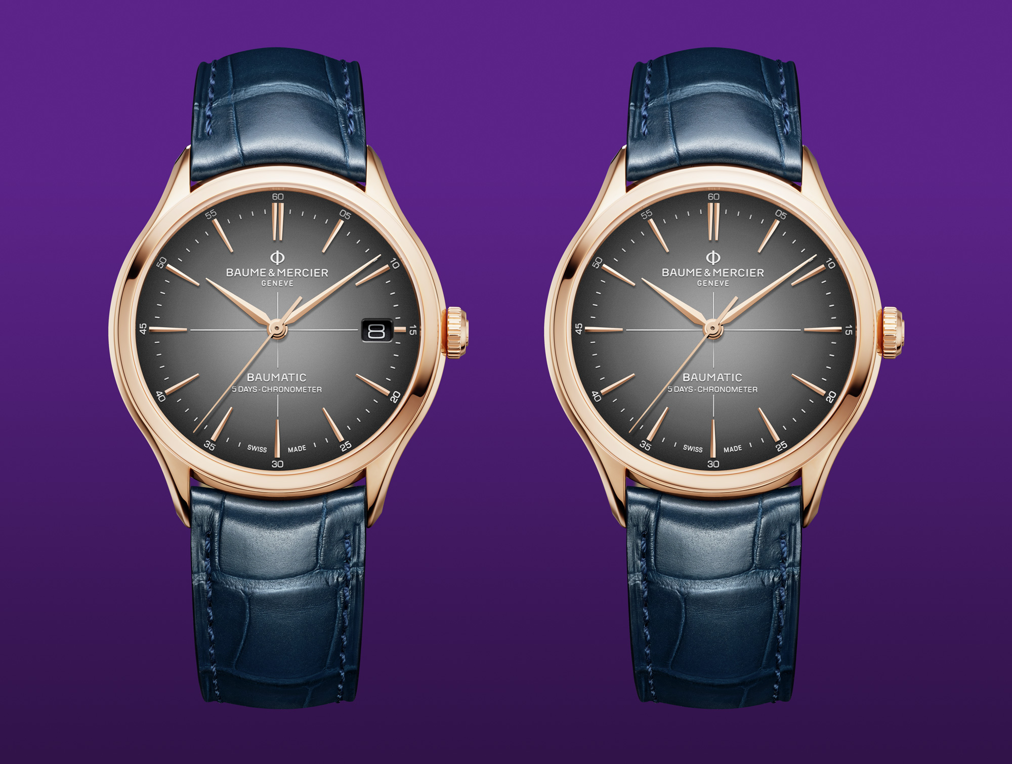
A comparison between the original Baume & Mercier Clifton – Ref. 10584 and a simulated no-date version. Starting image source: Baume & Mercier.
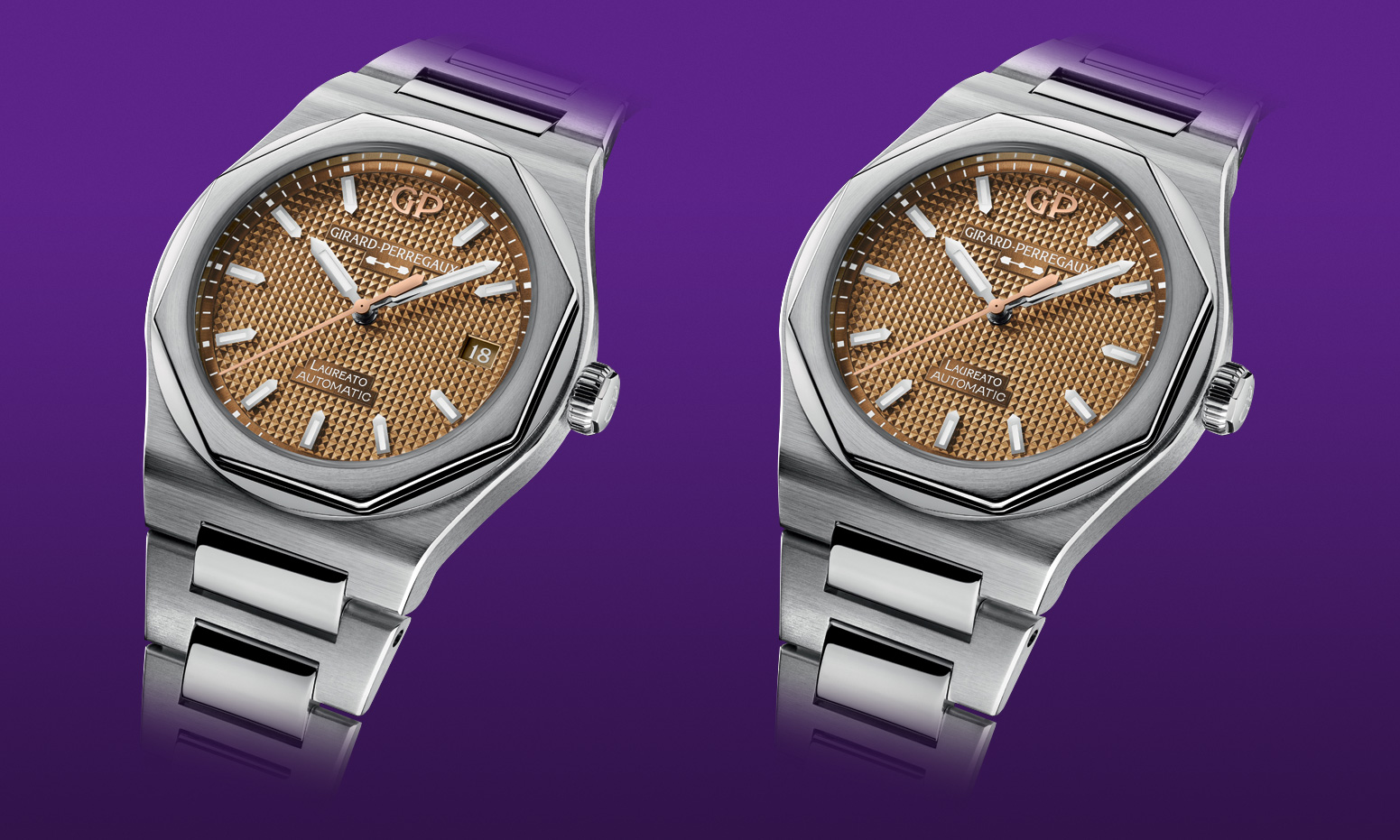
Date/no date comparison of a Girard-Perregaux Laureato 38 mm – Ref. 81005-11-3154-1CM. Starting image source: Girard-Perregaux.
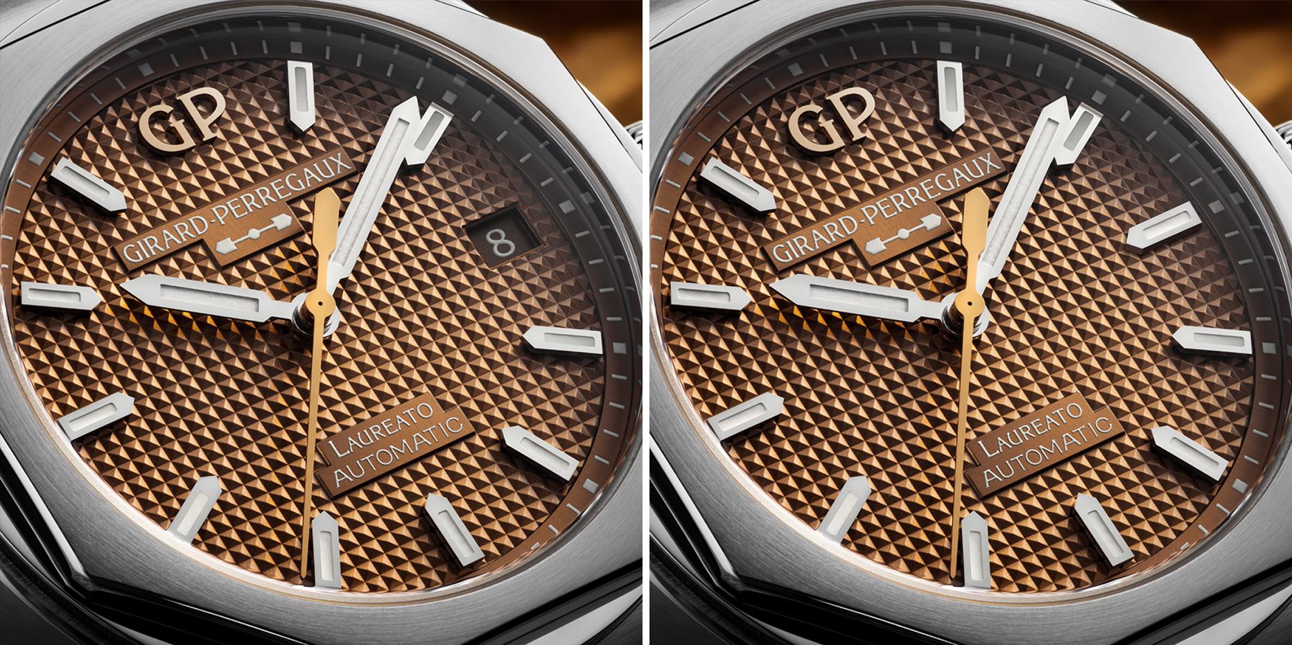
Date/no date detail comparison of a Girard-Perregaux Laureato 38 mm – Ref. 81005-11-3154-1CM. Starting image source: Girard-Perregaux.
There are of course exceptions. And what exceptions they are. Some asymmetrical dials transmit a sense of beauty and balance even though the complications are off-centered. The marvel in these cases is even more noticeable for me because my preference for symmetry is put aside. My sense of wondering reaches another level. It exceeds the usual appreciation leveraging the very fact that the misplaced elements aren’t misplaced at all.
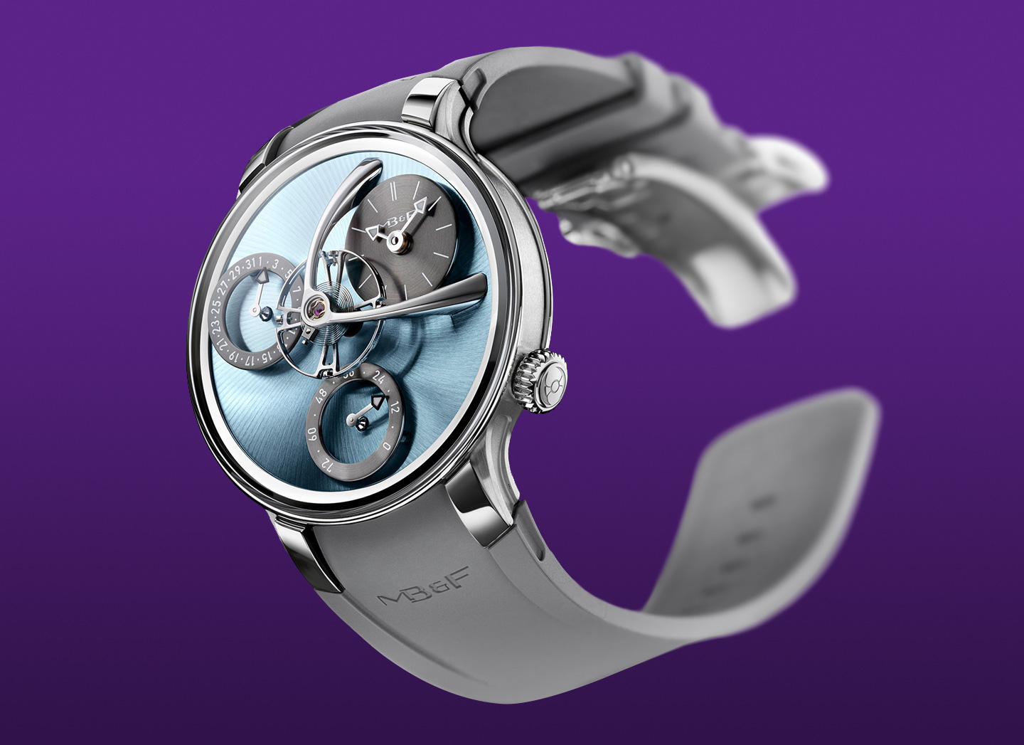
MB&F Legacy Machine Split Escapement EVO. Source: MB&F.
Other examples, despite being technically admirable and carrying top notch craftsmanship, show somehow packed dials that, in conjunction with their asymmetric nature, can be distracting to some extent. Sure, there’s a lot to praise and the owner can gaze endlessly the minute details showcased. In these cases the asymmetry study seems less balanced. To my eyes, they aim to another message: look at me and marvel at the plentitude I have to offer. The Greubel Forsey Double Balancier Convexe exemplifies this concept.
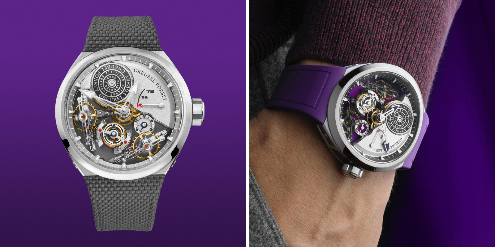
Greubel Forsey Double Balancier Convexe. Source: Greubel Forsey.
It never rains, it pours
May I be blunt? Rolex’s cyclops are one the esthetically ugliest things ever conceived in the watchmaking. I know, I know, the crowned company still sells over a million of watches per year and is by far the most successful brand in the industry. Regardless of my opinion. Evidently I’m part of the minority who can’t stand that … prosthesis.
The Rolex Cyclops lens: a serial dial ruiner, in my opinion. Source: Rolex.
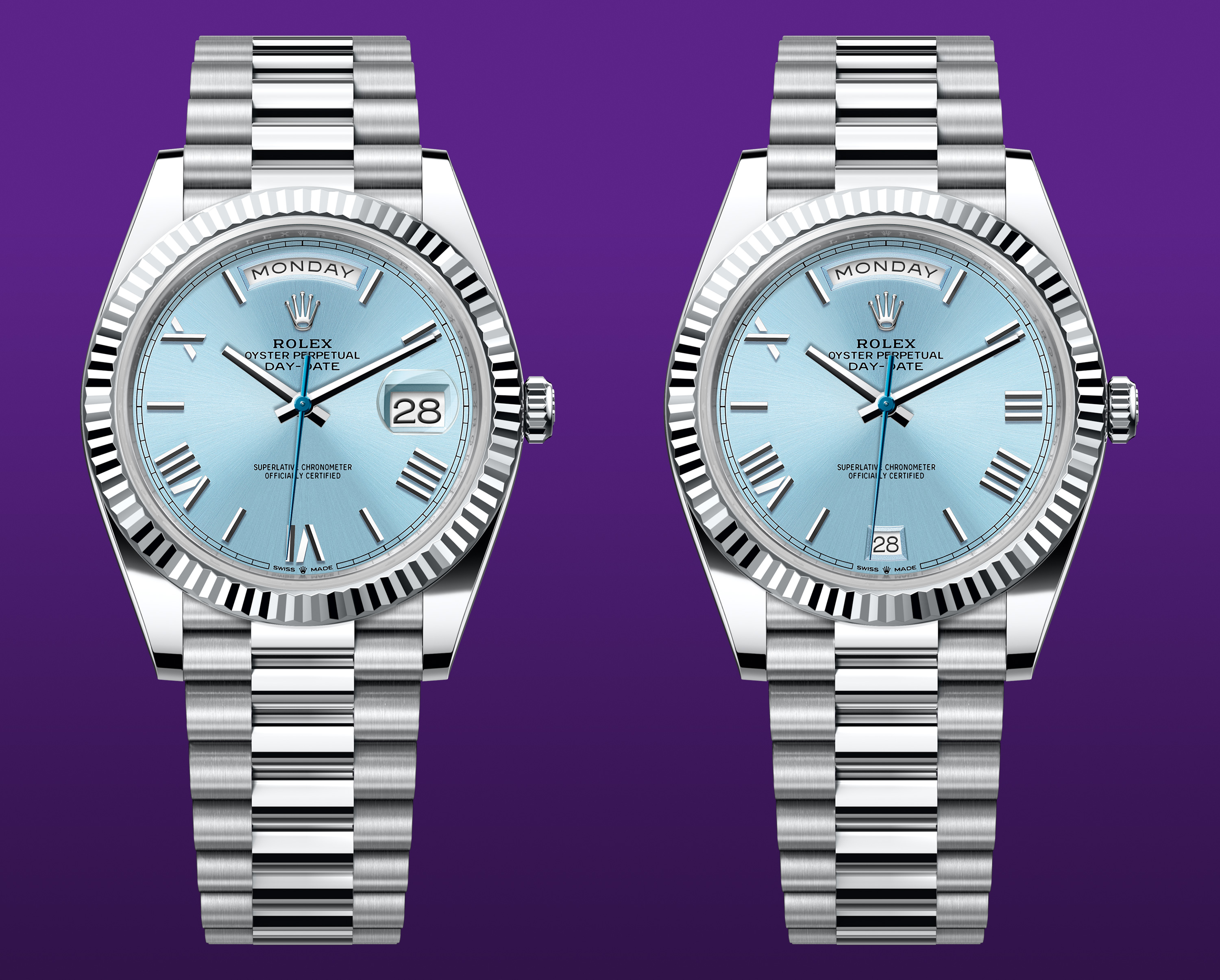
The date at 3 in conjunction with a magnifying glass: a combination I find particularly unfortunate. Yet customers love it and watches featuring the cyclops are sold as hot cakes. Don’t get me wrong: I respect the brand, its history an its role in the watch industry. Moreover, I get that a small date number can be difficult to read, especially for “seniors”. Still, it isn’t the most successful design choice in my opinion.
Rolex seems proud of it because, I guess, its purpose works and it has become an identity element of the brand. As a matter of fact, it’s in use since the 1950s. Actually, as far as I know, Patek Philippe was the first brand that tried to put a magnifying glass on top of the date of a 1518 Perpetual Calendar Chronograph in order to facilitate the date reading. It was a small plastic rectangular, placed over the day/month window, centered on the dial. Even though it resembles an afterthought it’s a better, more balanced and discreet design choice.
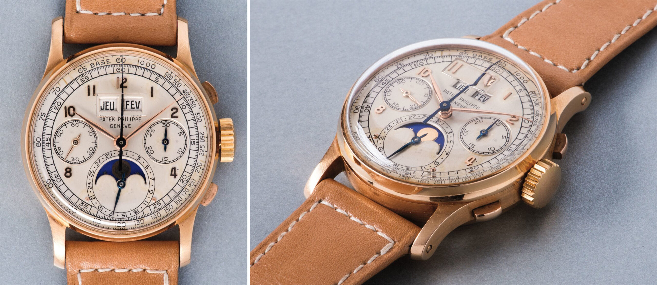
A Patek Philippe 1518 Perpetual Calendar Chronograph featuring an early example of magnified date. Source: Phillips.
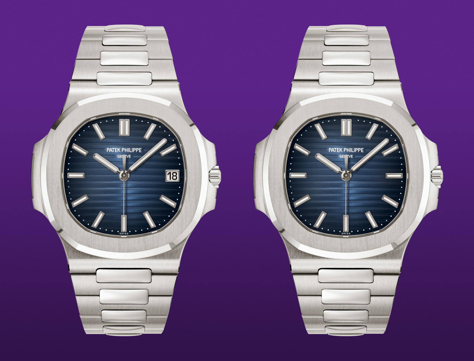
The cyclops are technically more refined. Unfortunately they are visually too invasive, for my taste. As a exercise of style I made a bunch of mockups with a different approach on the date position. Speaking of Rolex, I start with a comparison of a Datejust – Ref. 41126334 where the date is simply removed.
Date/no date comparison of a Rolex Datejust – Ref. 41126334. Starting image source: Rolex.
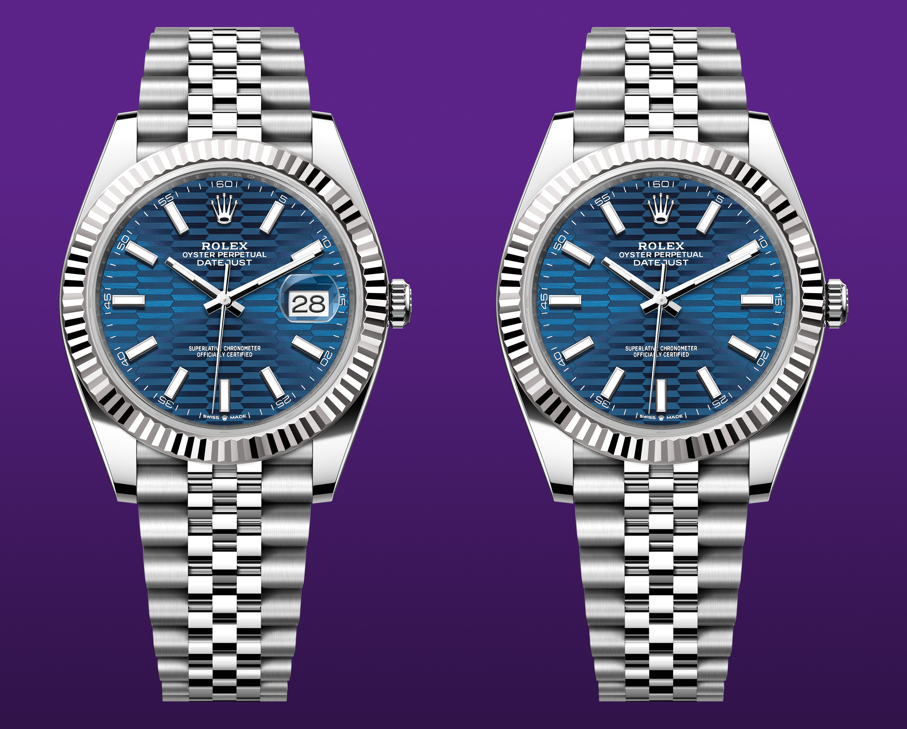
It’s followed by a comparison of a Rolex Day-Date 40 – Ref. 228236 where I moved the date at 6 o’clock. Curiously Rolex doesn’t put an arched cyclops on the day window. Evidently seniors have an eagle sight specialized for days 🤪.
Date at 3/date at 6 comparison of a Rolex Day-Date 40 – Ref. 228236. Starting image source: Rolex.
Here’s the Rolex GMT -Master II – Ref. 126710BLRO, again with the date at 6 o’clock.
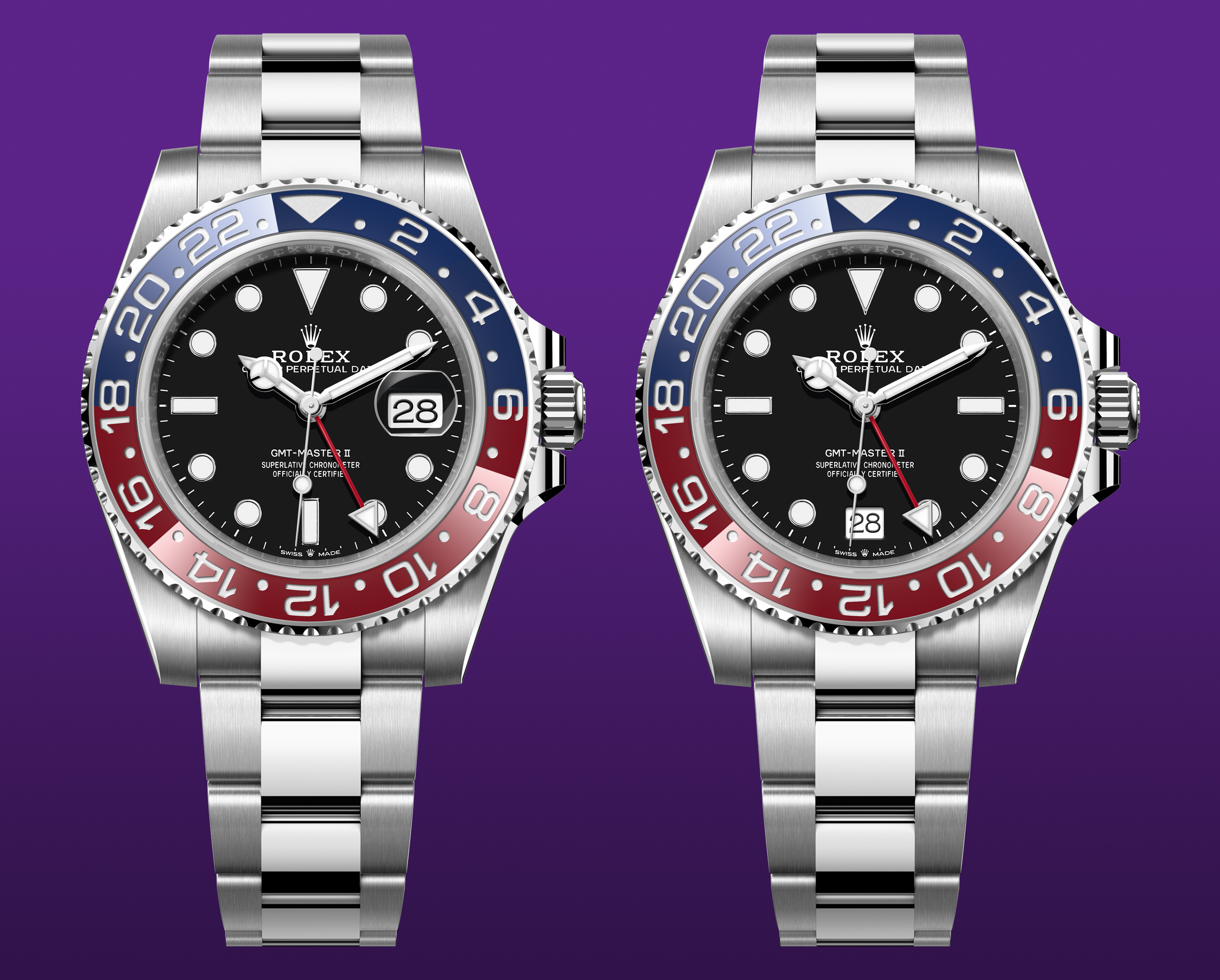
Date at 3/date at 6 comparison of a Rolex GMT Master II – Ref. 126710BLRO. Starting image source: Rolex.
This is the Rolex Yacht Master 37 – Ref. 268622, without the date.
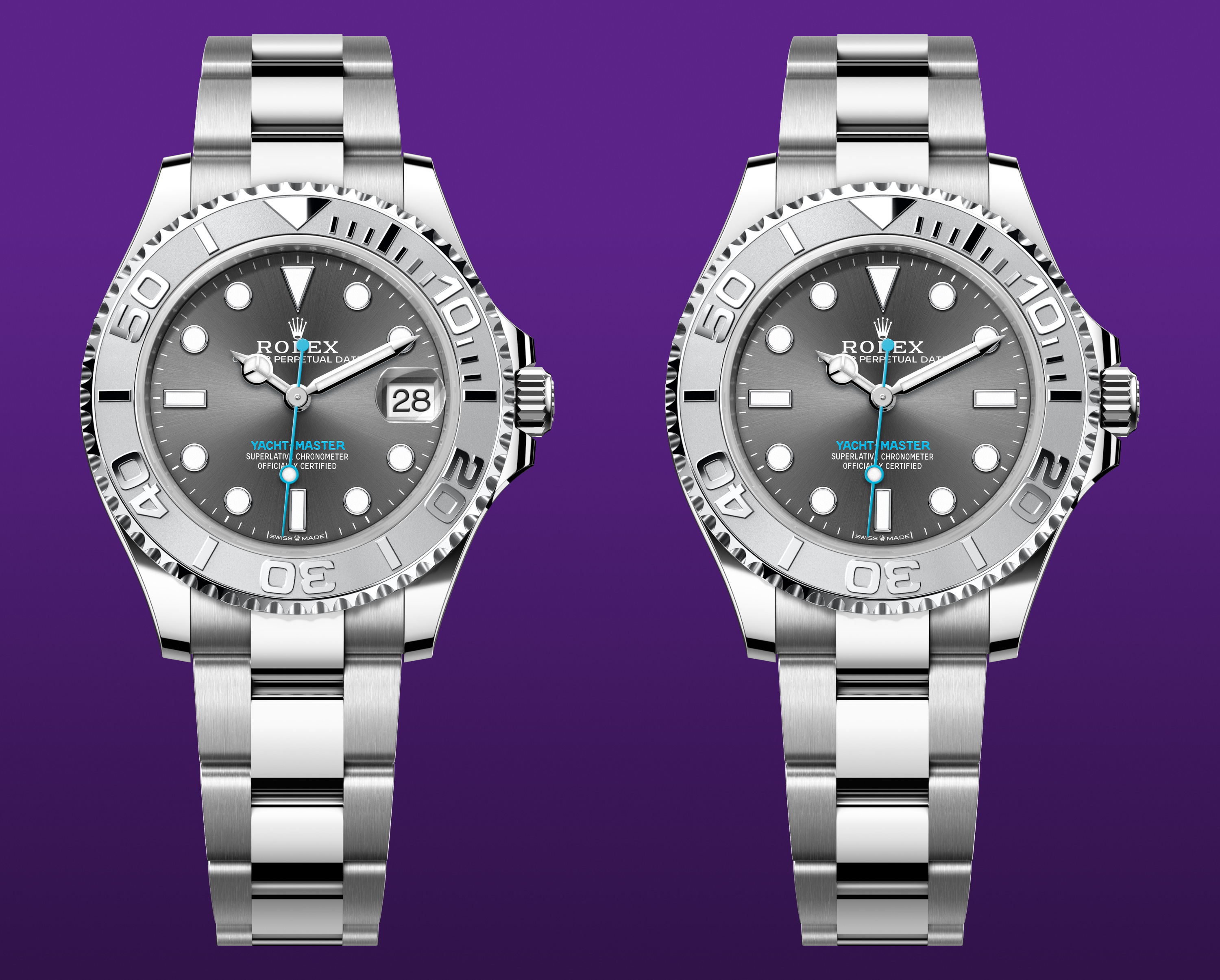
Date/no date comparison of a Rolex Yacht Master 37 – Ref. 268622. Starting image source: Rolex.
Let’s move or remove the date
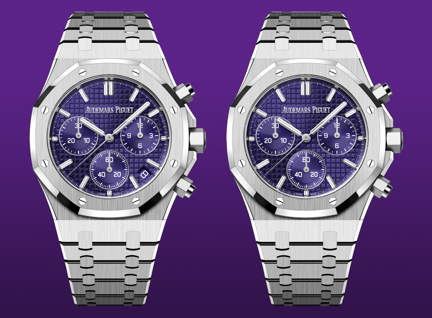
Continuing the exercise of style focused on the date position, I turn to Audemars Piguet Royal Oak. The Swiss maison carefully tries to integrate the complication choosing a proper size and a date background matching the dial. The result is convincing with a date not too much prominent and well camouflaged with the brand’s recognizable tapisserie.
The chronographs feature a 4:30 date following the same design principles. Nevertheless, I wanted to check the absence of the date on a couple of dials. Here’s a comparison of the Audemars Piguet Royal Oak Selfwinding – Ref. 15510OR.OO.1320OR.03 and its date detail.
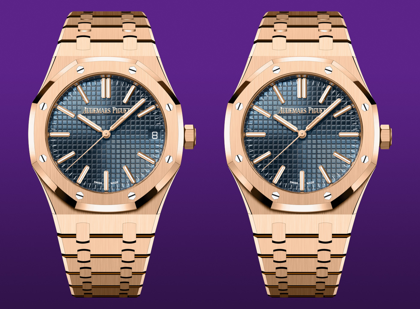
Date/no date comparison of an Audemars Piguet Royal Oak Selfwinding – Ref. 15510OR.OO.1320OR.03. Starting image source: Audemars Piguet.
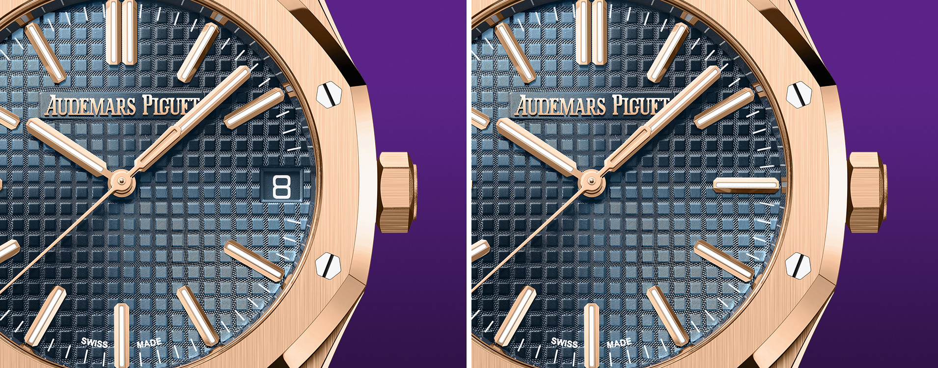
Date/no date detail comparison of an Audemars Piguet Royal Oak Selfwinding – Ref. 15510OR.OO.1320OR.03. Starting image source: Audemars Piguet.
The Audemars Piguet Royal Oak Selfwinding Chronograph – Ref. 26240BC.OO.1320BC.01 featuring the date at 4:30 and a mockup with no date whatsoever.
Date/no date comparison of an Audemars Piguet Royal Oak Selfwinding Chronograph – Ref. 26240BC.OO.1320BC.01. Starting image source: Audemars Piguet.
The date of the Patek Philippe Aquanaut – Ref. 5167R pops a little bit more due to the contrasting white background. Here’s the comparison with a hypothetical no-date variant.
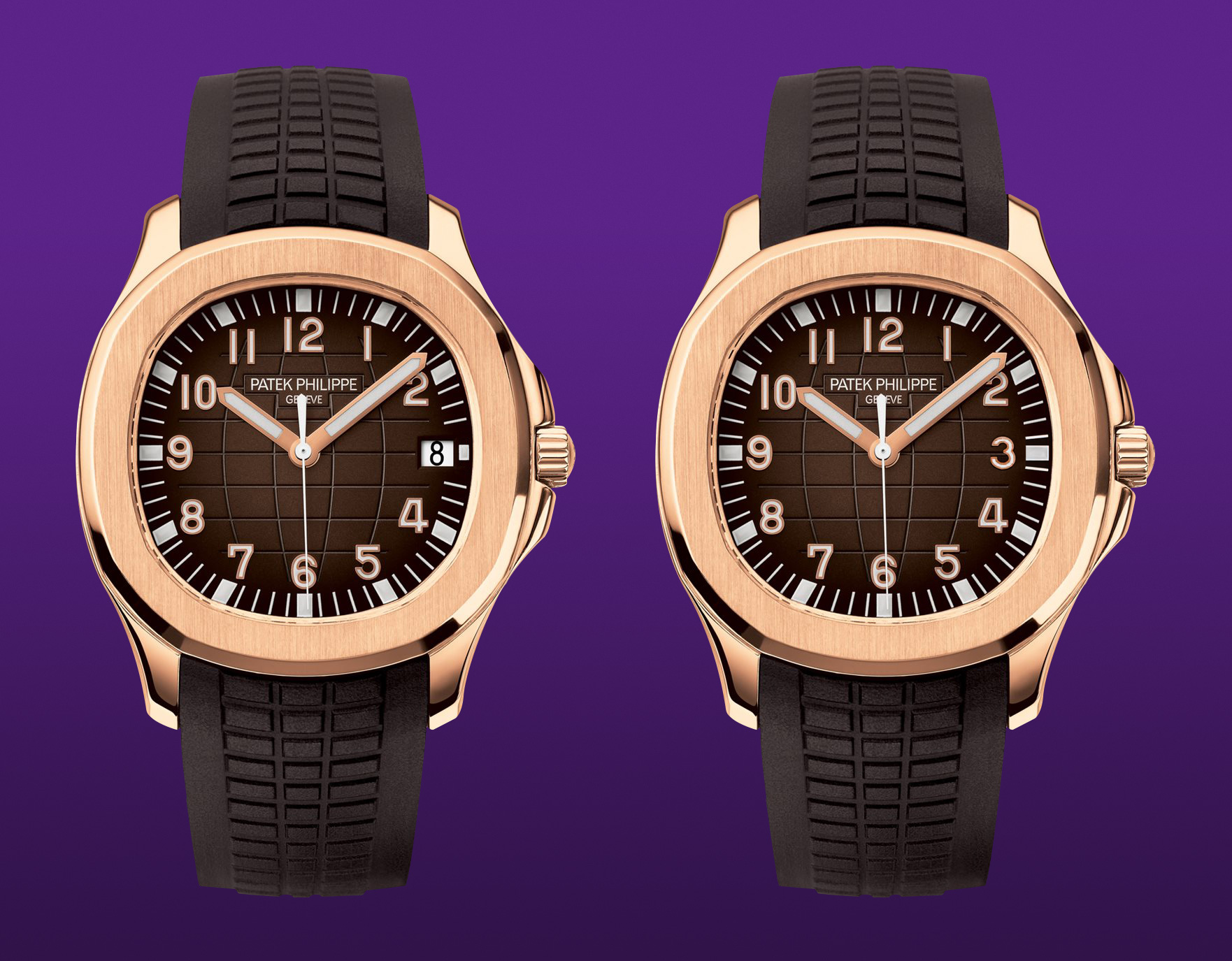
Date/no date comparison of a Patek Philippe Aquanaut – Ref. 5167R. Starting image source: Patek Philippe.
The chronograph variant Patek Philippe Aquanaut – Ref. 5968G understandably follows the same design approach. Another date/no-date comparison.

Date/no date comparison of a Patek Philippe Aquanaut – Ref. 5968G. Starting image source: Patek Philippe.
The Patek Philippe Nautilus – Ref. 5712-1A has a more confusing dial. It’s not my cup of tea – I find it too cluttered. It’s a consequence of Genta’s Nautilus case which has a prominent bezel constraining the dial and its complications. Here’s a comparison with removed power reserve. I admit that the cramped subdials could cause legibility issues. Hence I made two variants.
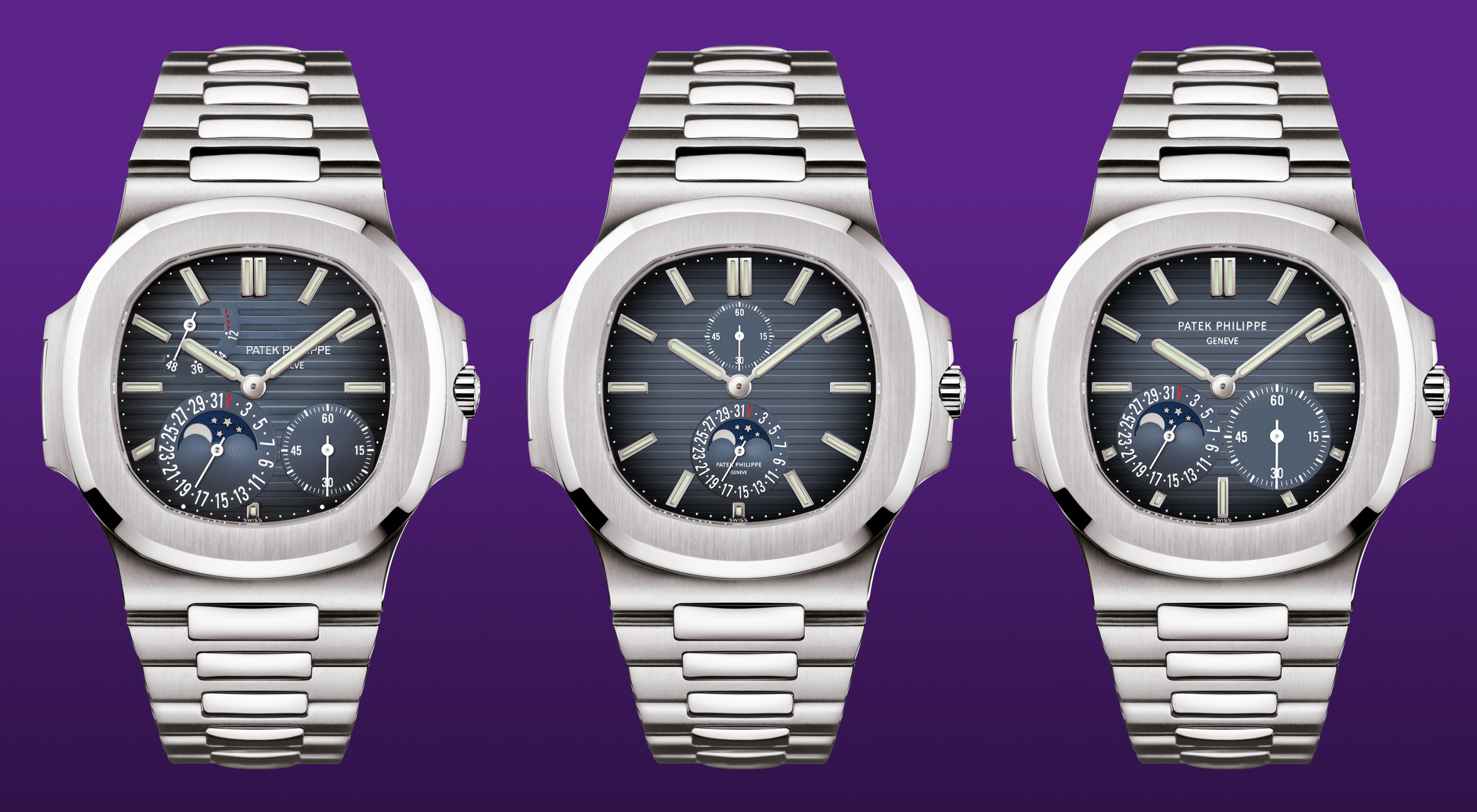
Original/two retouched comparison of a Patek Philippe Nautilus – Ref. 5712-1A. Starting image source: Patek Philippe.
The power reserve is a useful complication – especially for automatic watches – to check the winding status. Usually it isn’t often checked during the day. Nowadays the sapphire case backs are commonly adopted. A clever solution is to place the power reserve on the back, taking advantage of the movement acting as a sort of “second dial”.
Here’s a good example by Grand Seiko – Ref. SBGY026 and Ref. SLGA009.
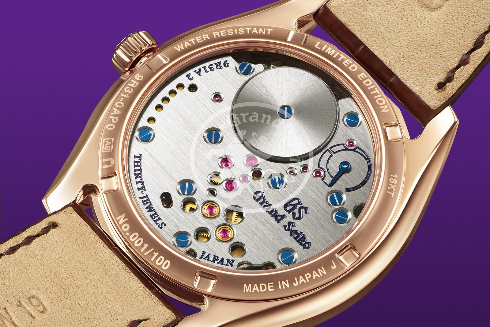
Grand Seiko – Ref. SBGY026. Source: Grand Seiko.

Grand Seiko – Ref. SLGA009. Source: Grand Seiko.
Speaking of movements coupled with excellent symmetry, Rexhep Rexhepi Chronometre Contemporain offers a stunning symmetrical layout on the dial as well as on the back.
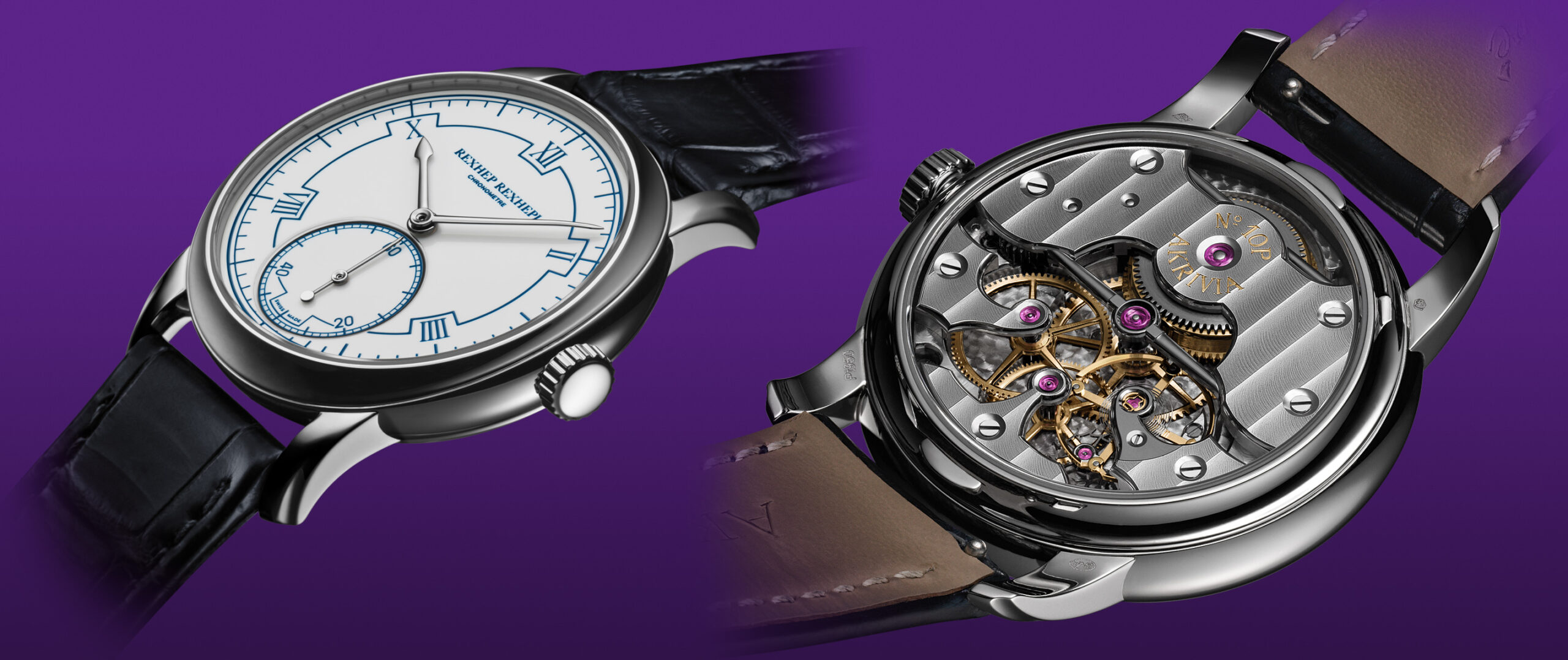
Rexhep Rexhepi Chronometre Contemporain. Source: Rexhep Rexhepi.
Back to Patek Philippe with two another mockup comparisons: the Patek Philippe Nautilus – Ref. 5811-1G and Ref. 5980-1A, again with and without date.
Date/no date comparison of a Patek Philippe Nautilus – Ref. 5980-1A. Starting image source: Patek Philippe.
Date/no date comparison of a Patek Philippe Nautilus – Ref. 5811-1G. Source: Patek Philippe.
Vacheron Constantin is one of my favorite maison. Regardless the evenness of the dials, their watches are proportionally harmonious and elegant. A remarkable example is the Vacheron Constantin Cornes De Vache – Ref. 1955-5000H-000A-B582.
Vacheron Constantin Cornes De Vache – Ref. 1955-5000H-000A-B582. Source: Vacheron Constantin.
I tried to simulate a moved date on the Overseas – Ref. 4500V-110R-B705.
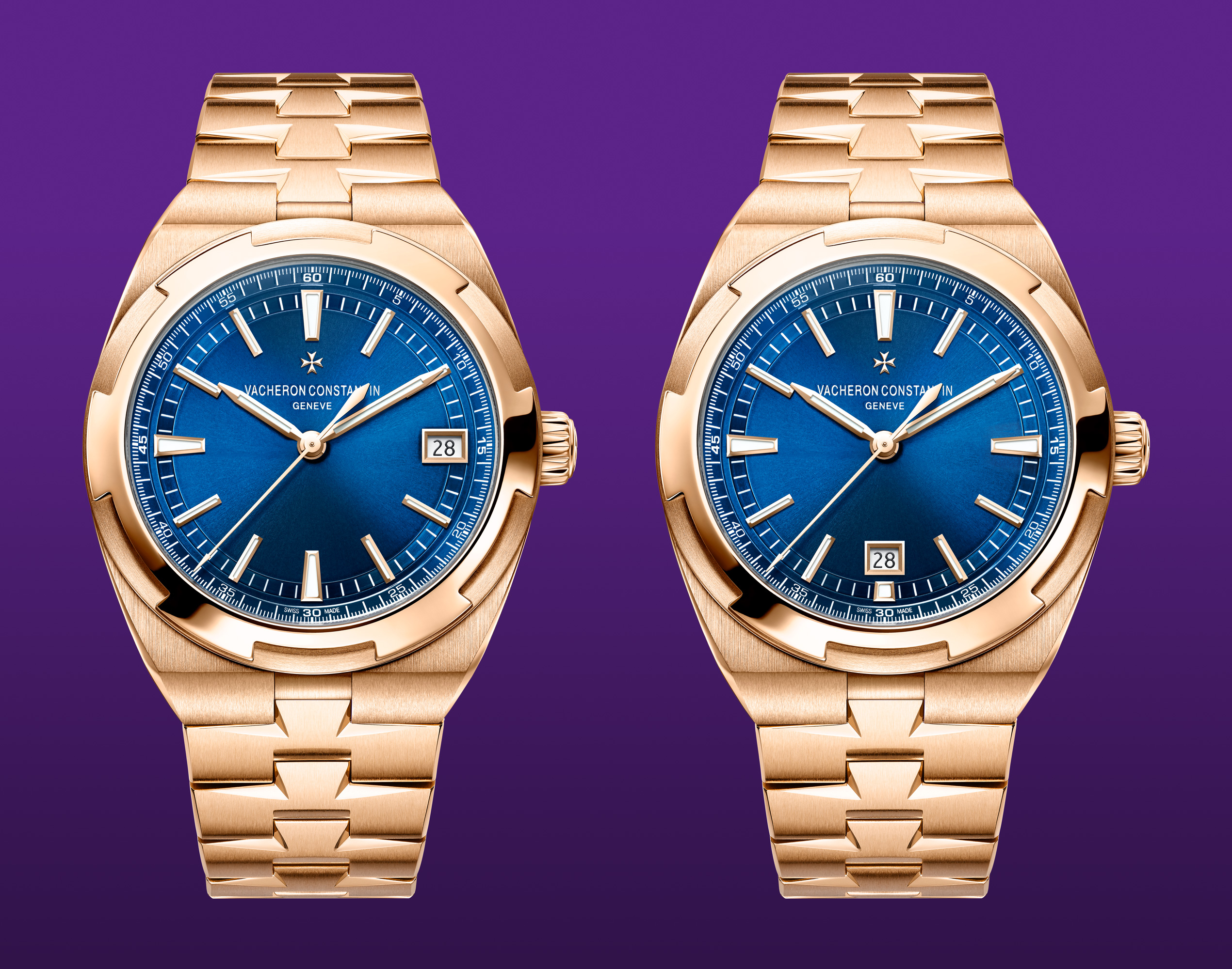
Date at 3/date at 6 comparison of a Vacheron Constantin Overseas – Ref. 4500V-110R-B705. Starting image source: Vacheron Constantin.
A similar retouching I made on the 222 – Ref. 4200H-222J-B935. In this case I added a stainless steel version and a more vibrant and “daring” gold-blue combination.
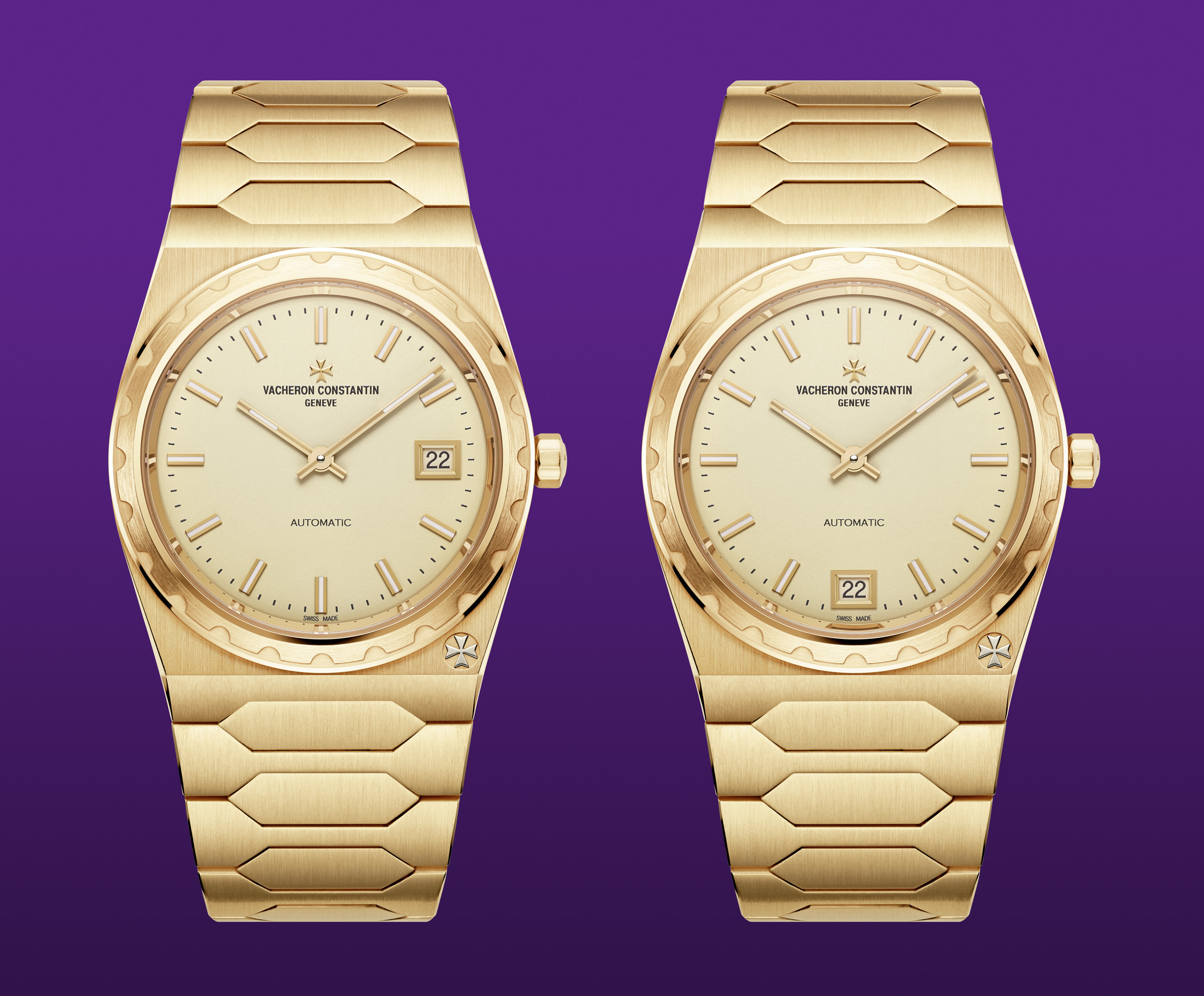
Date at 3/date at 6 comparison of a Vacheron Constantin 222 – Ref. 4200H-222J-B935. Starting image source: Vacheron Constantin.
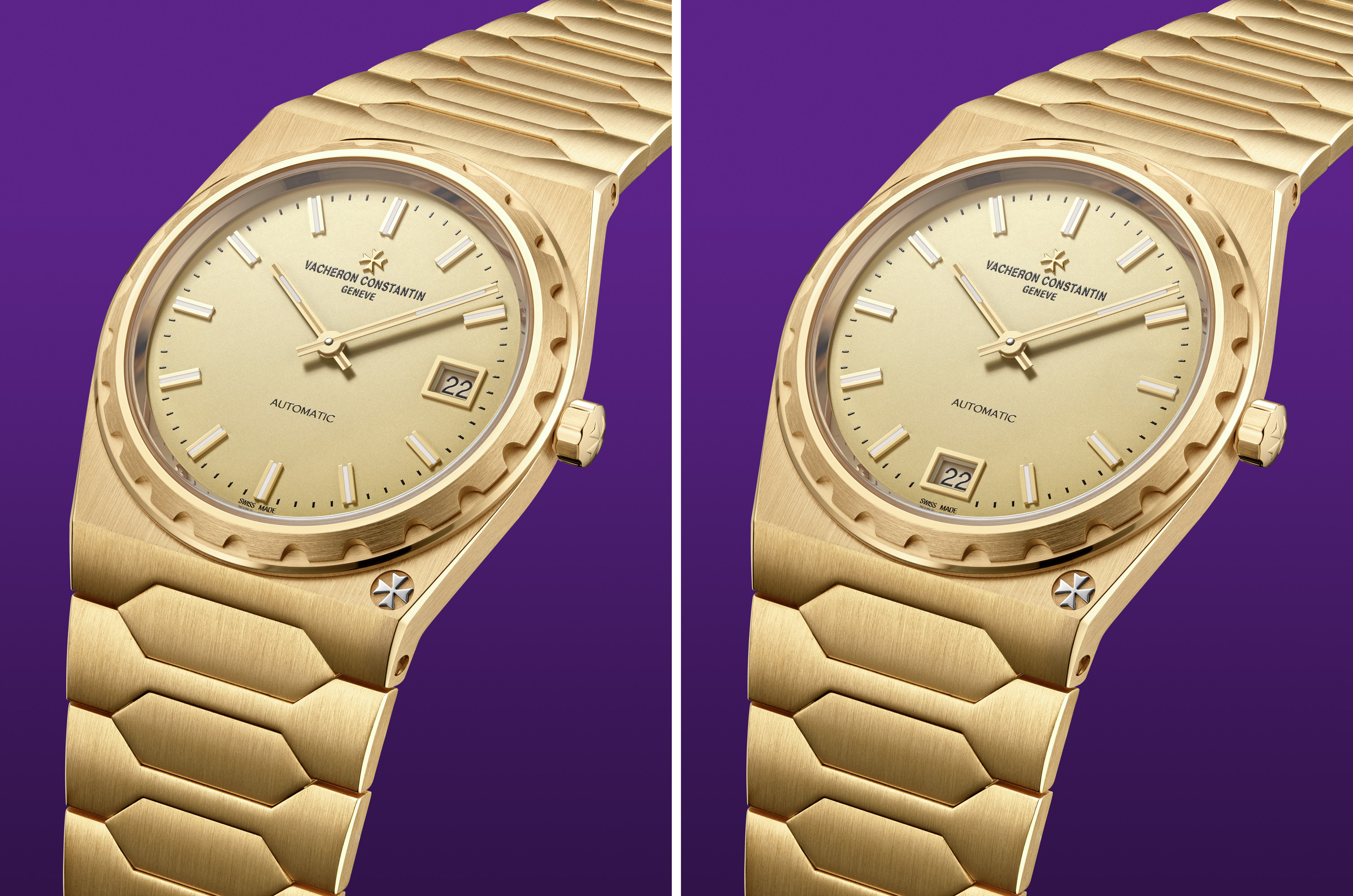
Date at 3/date at 6 comparison of a Vacheron Constantin 222 – Ref. 4200H-222J-B935. Starting image source: Vacheron Constantin.
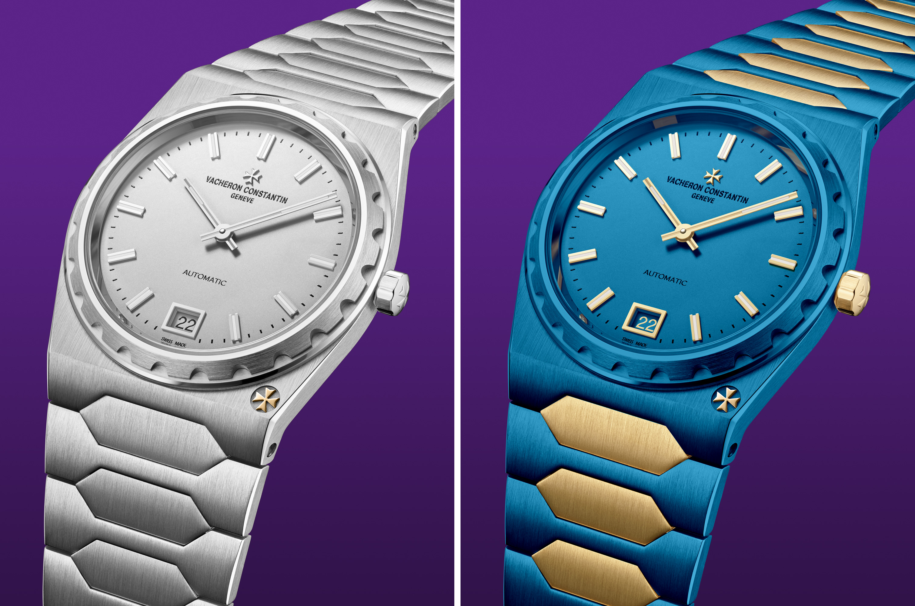
Steel and custom simulation of a Vacheron Constantin 222 – Ref. 4200H-222J-B935. Starting image source: Vacheron Constantin.
Crooked sometimes works
When I first encountered a dial with a date at 4:30 I was puzzled. At first it didn’t make sense. Then I realized that the idea wasn’t crazy. In a constrained place like a watch dial you have to be creative and the inventiveness can lead to peculiar solutions. A valid example of a well executed “crooked” date, in my humble opinion, is the Zenith Chronomaster Sport – Ref. 03.3100.3600-69.M3100. The date window matches chromatically the dial and its size/placement is so well thought that you almost don’t notice it at first glance. It’s there without forcing abruptly neither the neighboring indexes nor the minute track.
Zenith Chronomaster Sport – Ref. 03.3100.3600-69.M3100. Source: Zenith.
Parmigiani Fleurier watches epitomize the understated elegance. Details, finishing, wearability and value are offered gently with no shouting or bold design statements. Form and substance merge with affinity forming a consistent timepiece for connoisseurs.
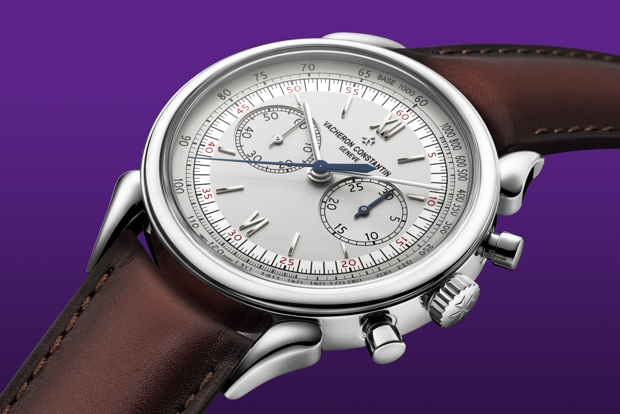
The brand under the guide of Guido Terreni recently introduced a chronograph with the date at 4:30. In this case the date isn’t 45° inclined. It’s straight. Out of curiosity I tried a 45° variant and, at the same time, to invert the contrast between the background and the number of the Parmigiani Fleurier Tonda PF Sport Chronographp – Ref. pfc931-2020001-400182.
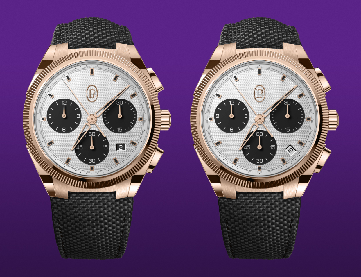
Straight/rotated date comparison of a Parmigiani Fleurier Tonda PF Sport Chronographp – Ref. pfc931-2020001-400182. Starting image source: Parmigiani Fleurier.
A reasoned disorder
I’ve already mentioned MB&F as a watch brand capable of making asymmetrical beauties. Another protagonist designing dials with apparently scattered complications is A. Lange & Söhne. The Lange 1 – Ref. 191.032 conceals a study of proportions, alignments and rules that work impeccably despite a seemingly random placement of hands and subdials.
As the saying goes, the beauty is in the eye of the beholder and yet A. Lange & Söhne’s works are widely appreciated. In the following image I show the plethora of geometrical and mathematical patterns that hold the overall dial layout.
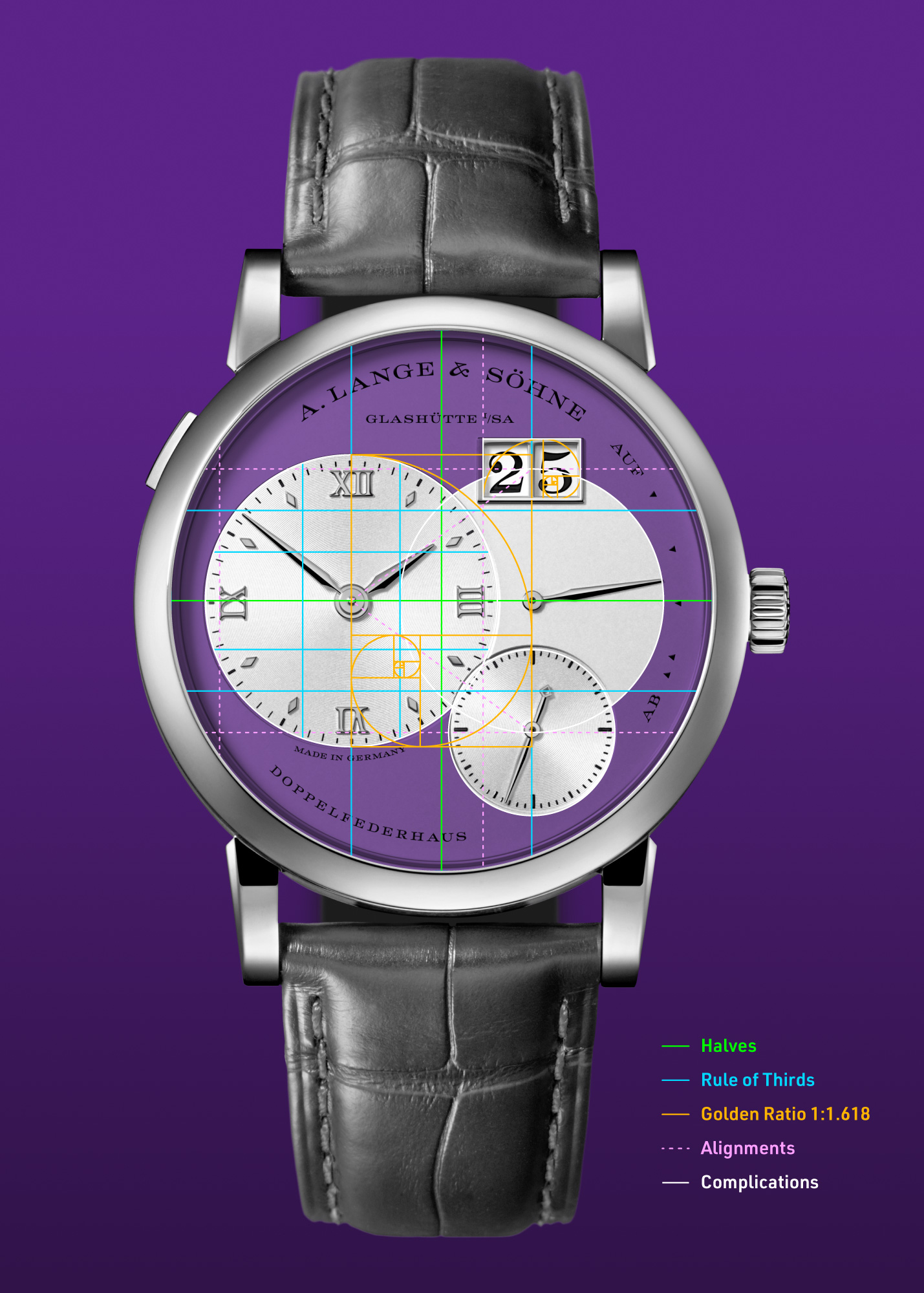
The neat and tidy dial layout of the A. Lange & Söhne Lange 1 – Ref. 1-191.032. Starting image source: A. Lange & Söhne.
A mixture of rule of halves, rule of thirds, golden ratios, alignments and centerings lead to a weighed disposition of elements on the dial that makes sense to our eyes even without measuring them.
Another brand sharing the same Saxonian origin and the skills to create offset dials is Glashütte Original. Again, they leverage the golden ratio to size the subdials and date windows. An example is the Glashütte Original PanoMaticLunar – Ref. 1-90-02-45-35-61. The diameter of the dial is the basis and the subdials follow the 1:1.618 proportion rule. The same ratio applies to the big date.
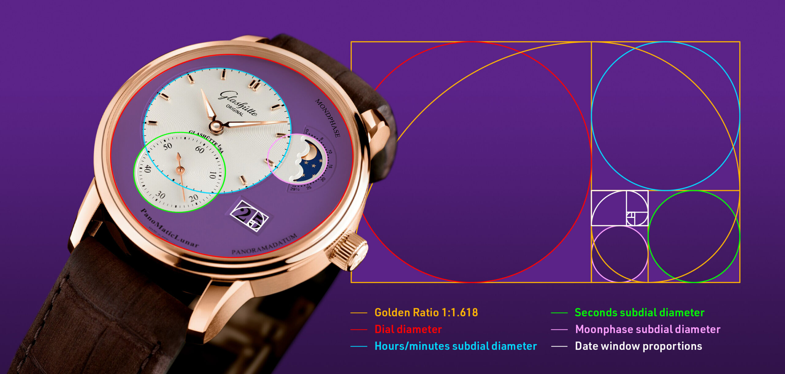
The golden ratio orchestrates the proportions of the Glashütte Original PanoMaticLunar – Ref. 1-90-02-45-35-61. Starting image source: Glashütte Original.
Wrapping up
In this short roundup I wanted to compare a few watches with alternative date positions. Alongside the mockups some well executed asymmetrically watches have been shown. These notable mentions are a proof that a properly asymmetrical dial is possible to achieve.
Granted, it’s easy to graphically move a date window here and there. Its technical feasibility is another story. Outsourced movements usually dictates the dial layout, not the other way around. Even with in house movements, spacing, gear train interaction and torque optimization has to be taken into account. Some brands/watchmakers are brave to dare the opposite approach: start with an idea of a dial and build a movement around it.
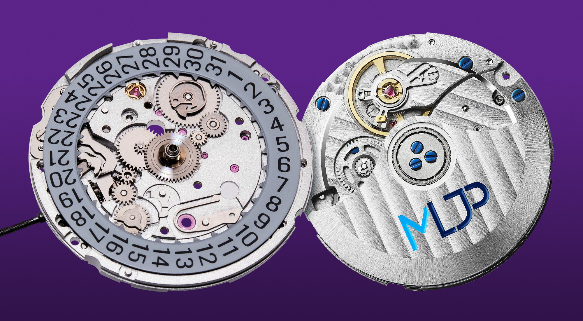
La Joux-Perret G100 movement. Source: The Naked Watchmaker, La Joux-Perret.
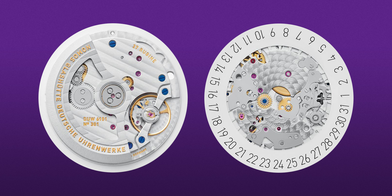
NOMOS Glashütte DUW 6101 movement. Source: NOMOS Glashütte.
Sometimes the folks fixated with date position are said to over reacting. The crown position is mentioned, stating that this element too breaks the symmetry of the case, yet rarely is criticized. To me the crown doesn’t visually impact in the same way the overall look of the dial. Luckily, the bezel act as a defined border giving the dial a dedicated identity space, partially detached from the rest of the outer case. The dial is way more prone to show any contained asymmetry or flawed proportions.
I’m not here to convince that my taste is right. Everyone has their own preferences. To each its own. There’s no absolute right o wrong, even though some esthetic styles are more widely accepted than others in our species (not only in the niche of watchmaking).
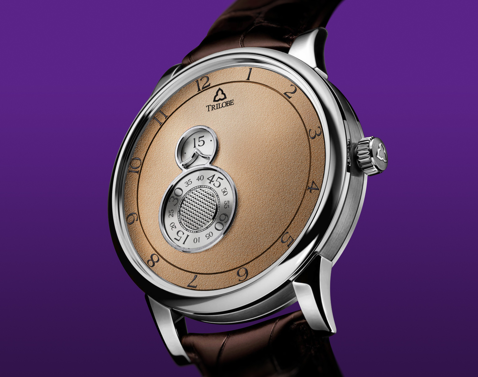
The pleasant asymmetry of the Trilobe Nuit Fantastique Dune – Ref. NF05DG. Source: Trilobe.
Actually, the abundance of watches with a date at 3 o’clock shrinks sensibly my wish list: at least it saves me a lot of compulsive purchases 😉.
One nice thing I noticed among watch collectors/enthusiasts is that the taste changes in time. People develop different preferences and, with time, they accept/embrace styles or technical solutions that years before were ignored or dismissed.It’s an open minded approach that counterbalance the opinion crusades that sometimes mark this and other hobbies.
A quick ending poll, if you want to share your opinion on this topic.
